1. Develop a Concept
A concept is likely one of the first things you will learn about in architecture or design school. It serves as the basis for all of your design decisions. It can be literal or abstract. For example, if you use a literal apple as your concept, your building may look like an apple. If you abstract the apple, your design may focus on how an apple is formed or grown. As you can see with the design of the Seattle Public Library, the form is intriguing but also functional. The design was based around arranging core components of the library in the most logical way, and the form was then generated from the interior layout. The most ideal library would be completely linear to easily locate books, but that isn’t very practical. The architects (OMA) of this library decided to make a ramp that travels up all of the floors instead. This is a great example of how a concept informed the entire design of a structure.
2. Focus on Alignment
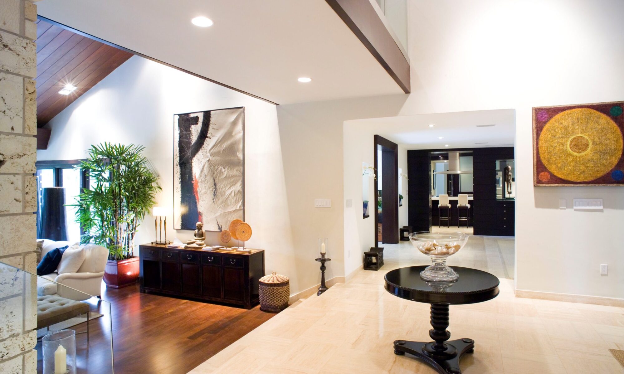
The second, and possibly the most important of design tips, is alignment. The first image represents an example of poor alignment. You can see by just being off by a small amount, the alignment of the ceiling and walls creates a bit of an eyesore. If each point were to come together at the same point, it would create a symmetrical and intentional alignment.
3. Be conscious of scale
Scale can sometimes be easily overlooked, which makes it just as important as other design tips. You have to keep in mind the function of the space when you are designing to use an appropriate scale. For example, this house featured on Architectural Digest includes an over-sized front door, large stairs, and super high ceilings. These features may be neat for a gallery or large event, but they’re not practical for everyday use for one person.
4. Maintain proportions
Possibly the second most important design tips are proportions. It really comes down to the unification of alignment and scale. Similarly to how the scale is relative to the user, the proportion is relative to the other pieces of the building. When looking at a proportional building, one side may be twice as long or the same size as the first side. The Parthenon is a perfect example of proportion. The capital of the column is the same length as the space between each column. The details in the frieze are proportional to each other as well.
5. Don’t forget the details
Details are essentially the culmination of all of the previous design tips. If you keep each one of them in consideration when designing, you can create beautiful details. The façade of this building was clearly well-thought. The geometric pattern is recessed and aligns perfectly with the reveals. Because of the attention to detail, the overall appearance and concept can shine through. Keep Reading
